
Opera Aesthetic Wedding Ideas: Designing a Day That Feels Like the Final Act
May 7, 2026
Something is shifting in the wedding world. Couples are moving away from blush florals and bright whites. Now, they’re moving toward something with more weight. The opera aesthetic wedding is one of the clearest expressions of that shift in 2026. Deep colors, layered textures, architectural florals, and candlelight that feels almost cinematic. It’s not a trend so much as a design philosophy. When it’s executed with intention, it creates a room that doesn’t just look beautiful — it feels like something.
I’m Syd, the founder and creative director of In Ink Weddings, a full-service wedding planning and design studio. I take around ten weddings a year, by design. That limitation lets me go deep on every event I touch. I’m not just coordinating vendors. I’m directing a visual and emotional experience from start to finish. The opera aesthetic is one I’ve been working within long before Pinterest named it. I’ve spent years building weddings that feel intentional, layered, and emotionally charged, and this direction is one I believe in.
If you’ve been pulled toward something darker, moodier, and more dramatic than what you see on most wedding blogs, this post is for you. I’m breaking down what the opera aesthetic wedding means on a design level — the color story, the florals, the venue and lighting requirements — and helping you figure out whether it’s the right direction for your celebration.
What the Opera Aesthetic Really Means in Wedding Design
The phrase “opera aesthetic” is getting a lot of attention right now. But if you’ve only seen it as a Pinterest trend, you might be picturing something more theatrical than it actually is.
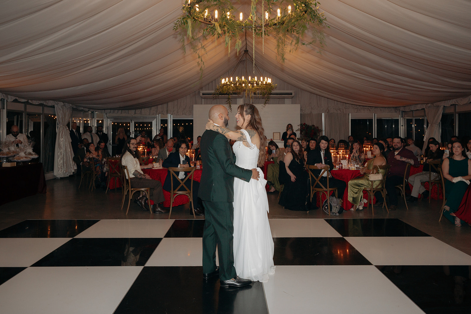
The opera aesthetic isn’t about costumes or literal opera references. It’s a feeling: dramatic, layered, deeply intentional, and emotionally charged. Think of the atmosphere in an opera house before the curtain rises. The weight of the room, the richness of the materials, and the sense that something significant is about to happen. That’s the emotional register this aesthetic reaches for in a wedding.
Visually, the language is specific. The opera aesthetic often includes:
- Layered, cinematic lighting
- Deep, saturated color palettes
- Heavy candlelight
- Architectural florals
- Rich textures like velvet and linen
What makes it distinct from maximalism-for-its-own-sake is intention. Every element is in conversation with every other element. Nothing is added because it fills space. The opera aesthetic is the direct counter-movement to the minimalist “timeless white and green” trend that’s defined wedding design for the past decade.
Understanding what this aesthetic is actually about changes how you approach every design decision. The color story is usually where couples start.
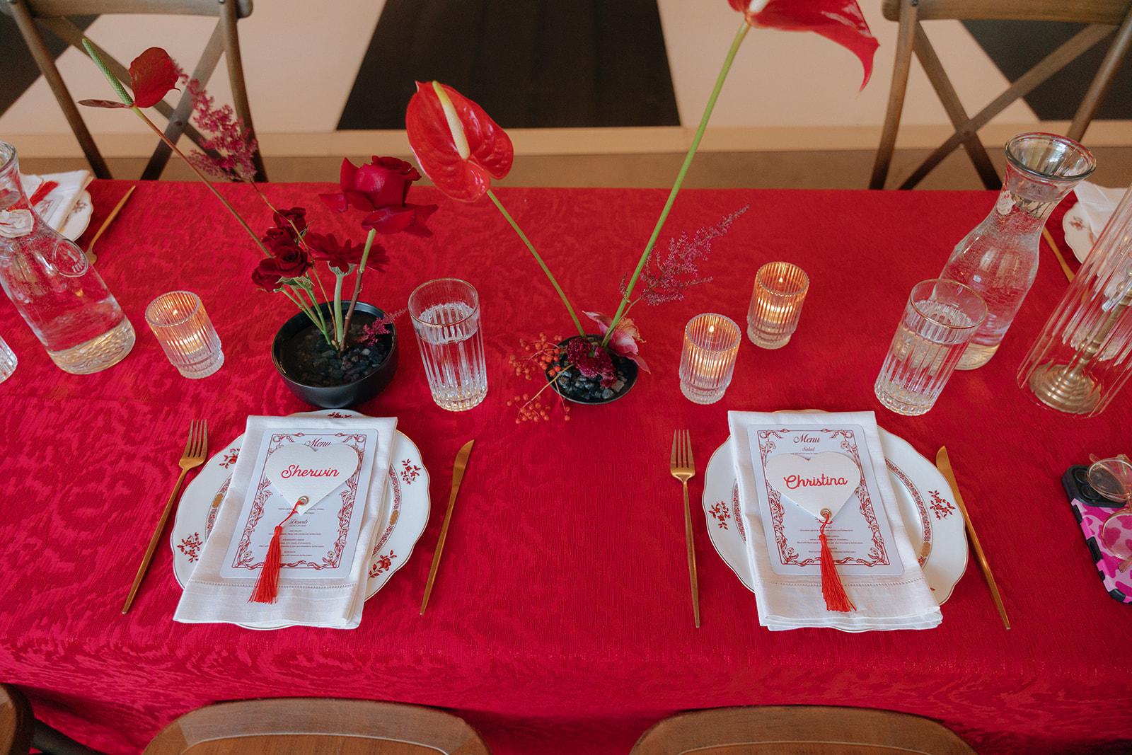
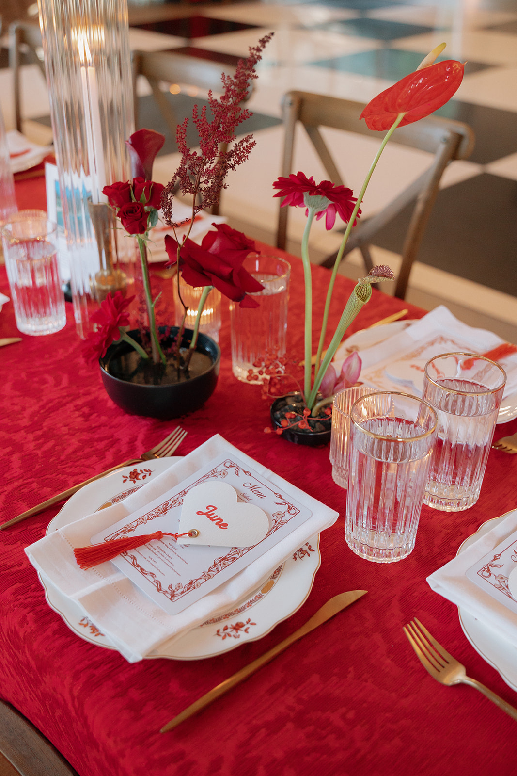
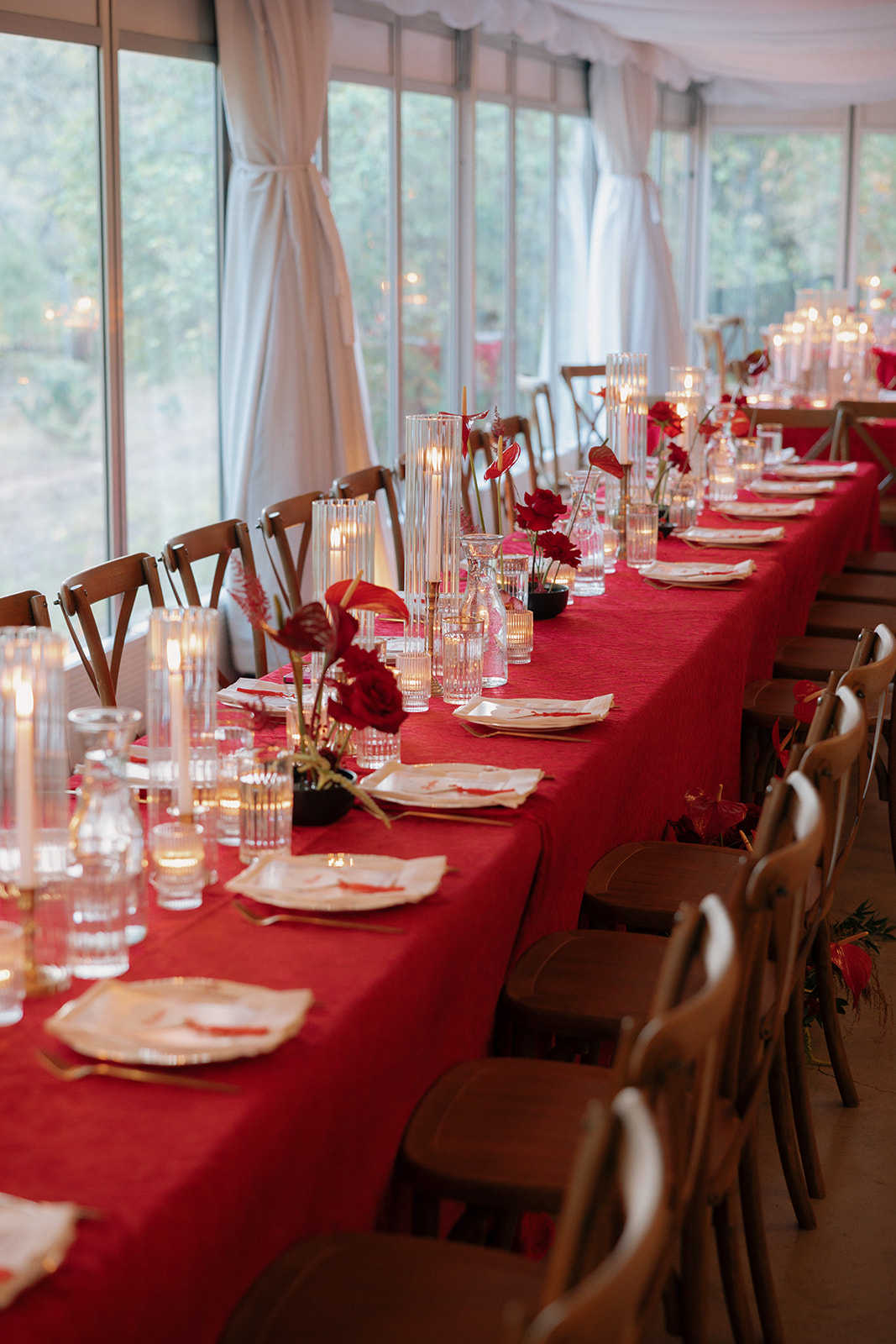
The Color Story: Deep, Saturated, and Unapologetically Bold
Color is the most immediate signal in opera aesthetic weddings. When you walk into a room designed in this direction, the palette lands before anything else does.
The core palette draws from deep, saturated tones.
- Burgundy
- Inky navy
- Forest green
- Plum
- Near-black
These colors aren’t chosen for shock value. They’re chosen because they do something specific in low-light environments. Under candlelight, a deep burgundy tablecloth becomes luminous. An inky navy velvet napkin looks almost liquid. The palette interacts with warm light.
What these colors communicate emotionally: gravity, romance, intention. They signal that you took this seriously. That you made choices.
The practical consideration most couples miss is where to use saturated color versus where to let it breathe. A deeply saturated palette across every surface can tip into feeling heavy. The most successful opera aesthetic weddings use contrast: deep tones on the tablecloth or drapery, lighter neutral surfaces underneath, warm metallics that reflect light back into the room. The palette leads, it doesn’t overwhelm.
For more on the design philosophy behind this approach, my post on Messy Luxury wedding design breaks down how restraint and richness coexist in the same story.
Once the palette is established, the florals are where the real conversation begins.
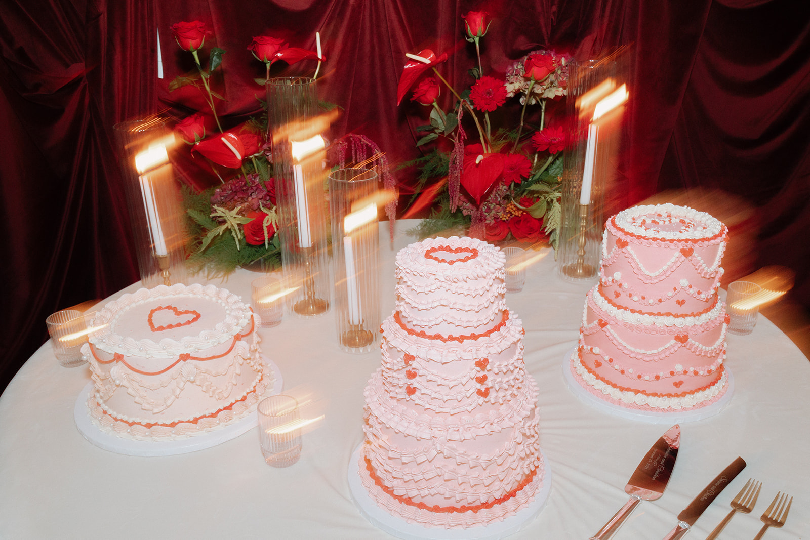
Florals, Candles, and the Art of Maximalist Design Done Right
Maximalism has a bad reputation in wedding design. When it goes wrong, it looks chaotic because there’s too much of everything, all competing for attention.
The opera aesthetic is maximalist by nature. But the keyword is edited maximalism. Every element earns its place.
For florals, the approach that works is lush but structured.
- Dahlias in deep burgundy or plum.
- Garden roses, ranunculus, and dark-toned anemones.
- Trailing greenery that feels wild but is placed with intention.
- Architectural arrangements that reach vertically into the space, using the height of the venue rather than just the width of the table.
Taper candles are non-negotiable in this aesthetic. They do two things at once: they fill vertical space without adding mass, and they create the warm directional light that makes this palette come alive. Mixing taper heights, grouping candelabras at different scales, and layering in pillar candles creates depth across the tablescape without adding more florals.
The editing principle: if an element isn’t doing something specific — adding texture, creating height variation, reinforcing the color story — it doesn’t belong. This is where wedding design rooted in intention differs from decoration.
Florals and candles create the experience above the table. What you can’t control, but absolutely must consider, is the architecture and light that surrounds all of it.
Venue and Lighting: The Foundation the Opera Aesthetic Requires
Not every venue can hold this aesthetic. That’s not a criticism of the venues, it’s just a design reality.
The opera aesthetic requires bones:
- High ceilings
- Stone or textured walls
- Aged architectural details
- Warm wood tones
- Indoor-outdoor flow
The venue isn’t a backdrop here. It’s an active participant in the design.
Warmth in the existing finishes helps, too. Exposed wood, antique brass hardware, garden settings with natural texture. The right venue will bring something to the opera aesthetic rather than asking all of it to come from the florals and linens.
Lighting is the layer most couples underestimate. In an opera aesthetic wedding, the lighting design should not be an add-on. Instead, consider it in your design early. Use candlelight as the primary ambient source and warm amber uplighting along walls and architectural elements. Make sure there is a deliberate absence of overhead lighting wherever possible. Cool or neutral overhead light kills this palette immediately.
The venues that work best in this direction tend to be:
- historic properties
- garden estates with indoor-outdoor flow
- or spaces with architectural bones that have been softened over time
When the venue is right and the lighting is designed to support the color palette, the last piece is documenting how all of this becomes a direction every vendor can execute from.
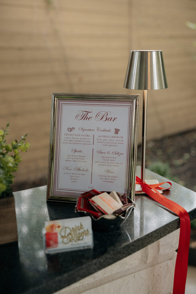
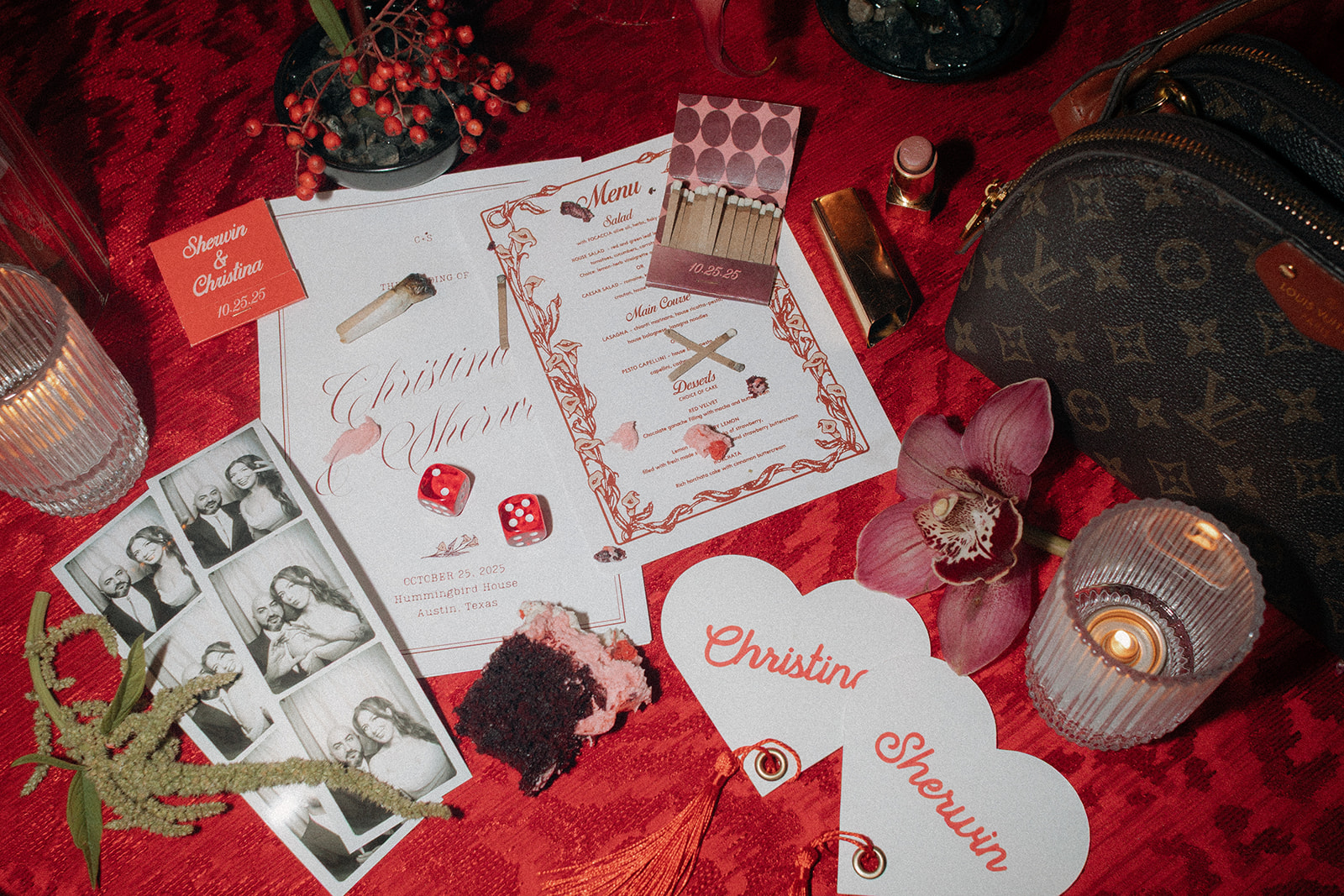
What an Opera Aesthetic Design Dossier Looks Like
At In Ink, every wedding begins with a design dossier. Essentially, it’s a creative document that translates the vision into something every vendor can execute clearly and cohesively.
Here’s what the dossier covers for an event in this direction:
- The color story, with specific material references
- The texture narrative: velvet vs. silk vs. linen, and where each lives in the design
- Floral aesthetic direction by arrangement type so the florist understands the editorial intent behind each
- A lighting brief for the AV and lighting team, with specific references to the warmth and directionality desired
- Imagery that captures the mood, such as editorial references, film stills, or architectural photography that conveys the feeling
Every vendor works from the same document. The florist and the lighting designer are building toward the same vision. Ultimately, you get cohesion across a complex, layered design by making sure everyone understands the feeling they’re reaching for.
The design dossier is also how couples walk into the planning process with confidence. They know what they’re building before a single vendor meeting happens.
Is the Opera Aesthetic Right for Your Wedding?
This aesthetic is specific. It’s not right for every couple, and that’s exactly the point.
You’re probably a candidate for an opera aesthetic wedding if several of these feel true:
- You’re drawn to drama, but you want it to feel intentional, not theatrical or costume-y
- Your venue has architectural character you want to lean into
- You’d rather your wedding feel like an experience than an event
- You aren’t afraid of dark colors or unexpected combinations, in fact, the unexpected combinations are what excite you
If you read this list and felt recognized rather than just inspired, maybe an opera aesthetic wedding is the right design for you.
No matter what direction you go in for your wedding aesthetic, just remember it should reflect you. The best weddings happen when the day truly represents the couple, not just a direction they loved on Pinterest without knowing why.
Let’s Build Your Opera Aesthetic Wedding
The opera aesthetic isn’t about recreating a Pinterest trend. It’s about creating atmosphere with intention. When this design direction is done well, guests don’t just notice the florals or candlelight. They remember how the room felt. The tension, the warmth, and the emotional weight of the entire event.
That’s exactly what I design for at In Ink Weddings.
Every wedding I create is rooted in story, sensory experience, and layered design that feels deeply personal to the couple at the center of it. Whether your aesthetic leans dark and dramatic or soft and sculptural, the goal is always the same: creating a celebration that feels immersive, intentional, and unmistakably you.
If you are planning a wedding and looking for a planner who can help translate your vision into a fully realized experience, I would love to connect. Get in touch with me here and let’s start building your design story.
And if you want a closer look at how I interpret Messy Luxury™ through wedding design, follow along on Instagram for behind-the-scenes planning, editorial inspiration, and real wedding moments.
